


The design and production of conference branding, marketing and event artwork.
State
About the Project
2025
Project Overview
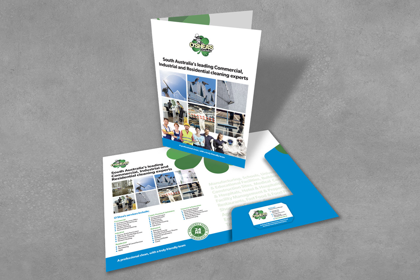
Starting in 1990, Sean O’Shea has built up Adelaide’s most trusted commercial, industrial and residential cleaning business. LAAD Creative was tasked with designing a contemporary brand language that still paid homage to their uniquely Irish-flavoured logo.
The work
Designing a new brand language for a business while retaining its current logo presents a unique challenge for any designer. Fortunately, this wasn’t our first rodeo, and we were able to use our experience gained from other similar projects over the years to provide a viable solution.
We generated a series of concepts for the updated brand language using stationery, folders, and various marketing assets as a base. These were tweaked and finessed until a design that ticked all the boxes was greenlit.
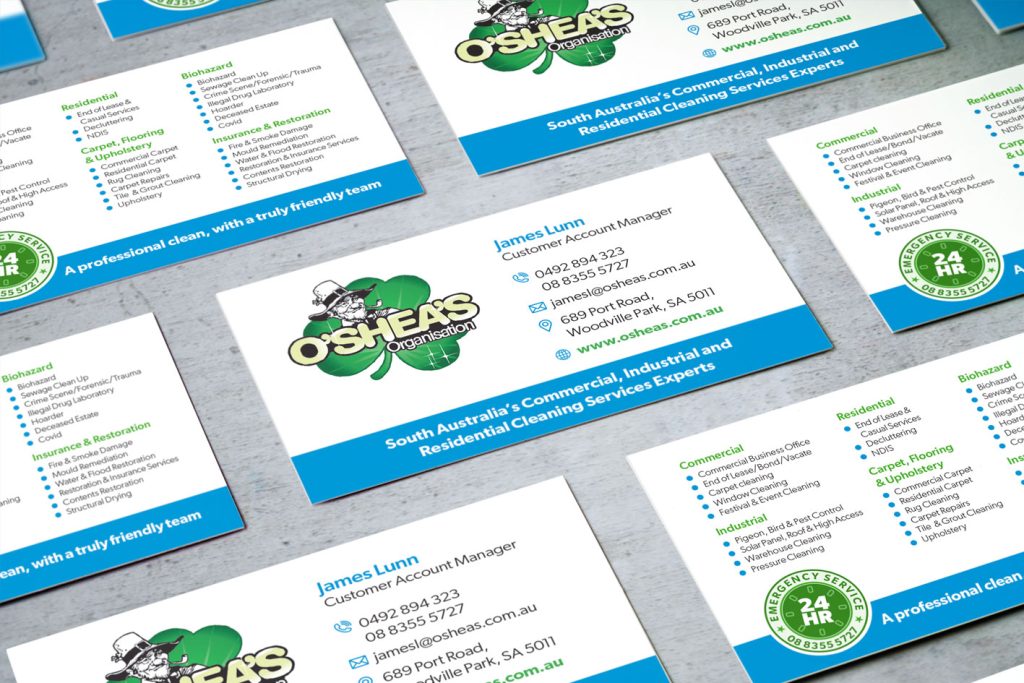
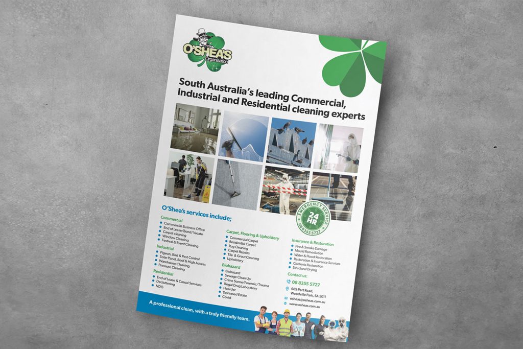
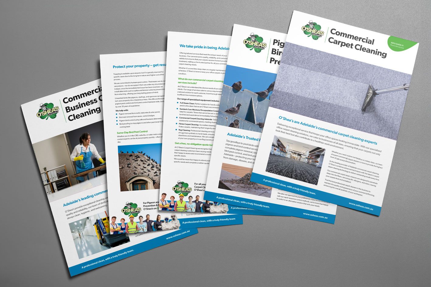
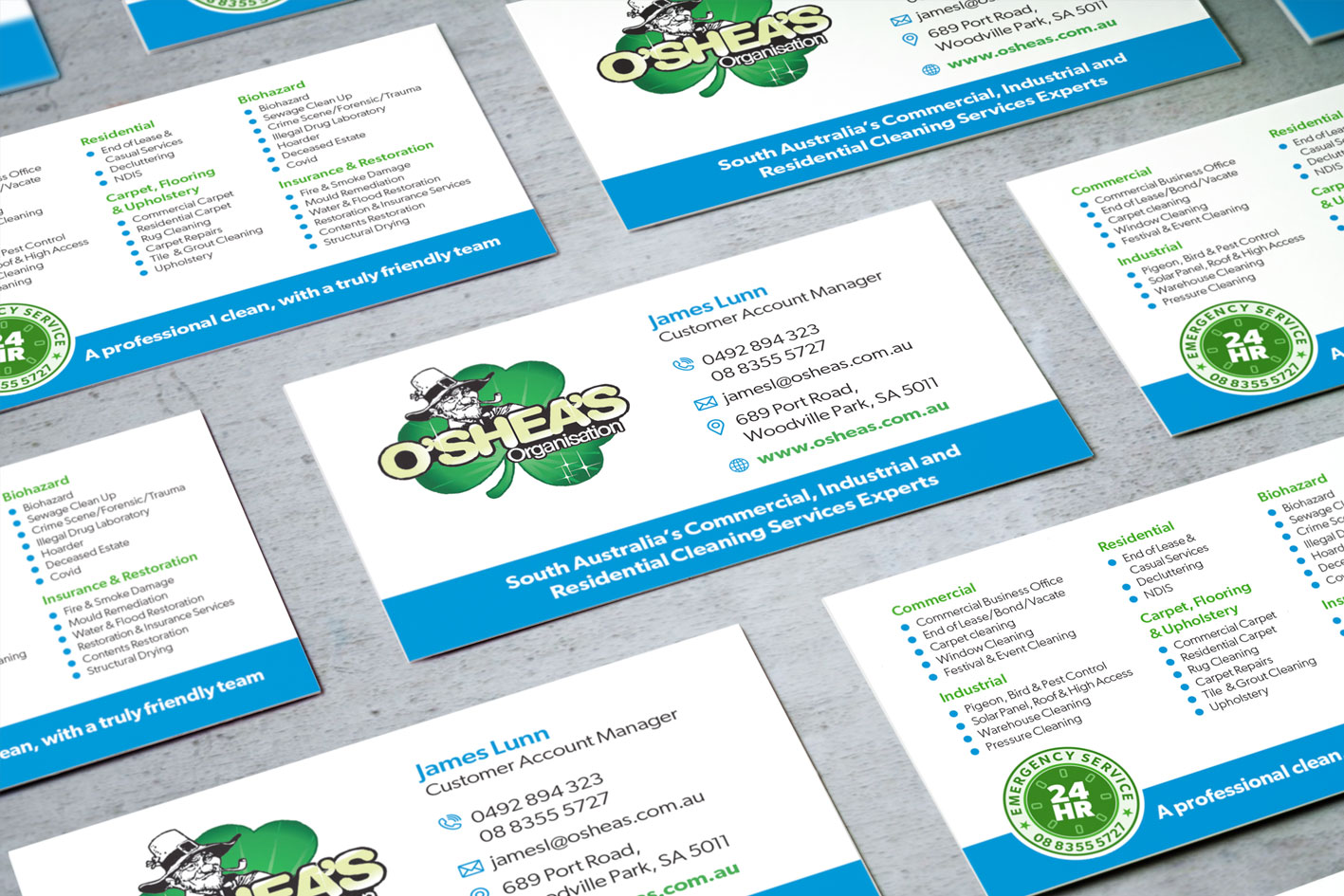
The driving force behind the update was to create a series of service flyers, 30 in total, that would be inserted into a presentation folder for the sales team to use as required, when canvassing new clients. These were supported with business cards, promotional flyers, a brochure and an email signature panel.
Supporting images supplied by O’Shea’s, we also researched and sourced suitable stock images and provided Photoshop manipulations as needed.
Related projects


Hawthorndene 100 Year Celebration
LAAD Creative donated our graphic design services to advertise and promote an unforgettable community event

Australian Rare Earths 2024-25 Annual Report
LAAD Creative designed, produced, printed and supplied a 92 page Annual Report.

Australian Rare Earths 2023-24 Annual Report
LAAD Creative was tasked with the design and production of a 80 page report.

ARIIA 2024 Facing the Future of Aged Care Conference
The design and production of conference branding, marketing and event artwork.

Exterior signage for South Adelaide Christadelphian Church
Exterior signage for South Adelaide Christadelphian Church
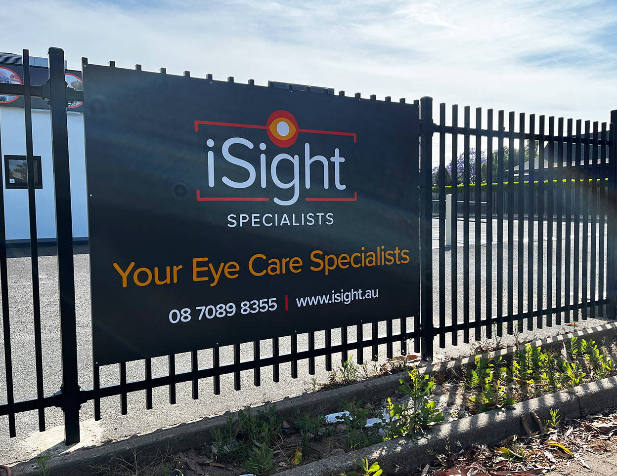
Exterior signage for iSight Specialists
Graphic design, manufacture and installation of all external signage.

Archer Materials marketing assets design updates
LAAD was commissioned to update the design language for a variey of marketing assets

Archer Materials 2024-25 Annual Report
LAAD Creative was tasked with the design and production of a 84 page report.